5 Ways to Spot and Avoid Bad Data
With the rise of big data there are big errors happening in how people talk and use data to justify decisions. In most organizations these erroneous uses of data are unintentional but that doesn’t make them less dangerous.
Arm yourself with these 5 common data slip-ups so you can spot bad data.
How to Spot Bad Data
Sample size (n^)
You can think of it as the “how many” of data. Sample size is one of the most overlooked aspects of data in the business world. There are many examples of individuals and business trying to make a data-driven decision but misunderstand what the data actually means. Data can look and sound impressive but if its only from 10 users, when you have at least 100 concurrent users every minute of everyday, you might overreact. 10 users might be great for some qualitative research but it’s not an appropriate proportion of the population for data approaches.
So what is a good sample size? For those of you wanting to dig deep, you should look in to how statistics analyzes margin of error and confidence intervals. For the rest of us sadly there is no hard-fast rule but context matters a lot… so if you have 2,500 customers don’t make a big deal out of the aggregation of 20 people’s data. As a starting point, anything with under 100 sample size should be met with some skepticism.
Misrepresentative sample
A similar issue to small sample size is when a sample is not representative. In this case, the basic issue is that the data does not match the real world. Let’s say your company works with three different businesses sizes: small, medium, and enterprise. Your product team is sharing research that your customers love the new simplified FAQs. The possible issue is that the team was only able to collected data from smaller organizations. What if the simplified FAQs oversimplified the answers in such a way that larger and more complex organization don’t like the change. The research being shared would not help you uncover this important trend.
So how do you make sure your sample is representative? Well being truly random is a good starting point. If, after the random selection, it seems weird that no large customers’ data was included try to find out why and share that detail. Then try to find other ways to investigate how those left out groups feel or act.
Distorted Graphing
Distorted graphing is a nice way of labeling graphs that are being deceitful. Here are the three most dangerous types:
- Exaggerated axis- this is when the y-axis is truncated to make difference seem larger. The different between 470 and 495 look much larger when your zoom in on just this small segment of the graph.
- Maximum manipulation- this is when the axis maximum is altered to change the way we interpret the data. People may increase the maximum to make something look more stable or decrease it to make the changes look bigger.
- Time selection: This is when the either the measurement of time or timeboxing is misleading. Showing the revenue for the past 3 quarter may make it looks like we are steadily growing but that’s not 100% correct. By zooming out just a little further we can see that the revenue is now just recovering after a major down town and that the revenue this time last year considerably higher.
So how do you spot these kinds of graphs? The best way to avoid distorted graphing is to first ensure the graph is properly labeled, look at the axes to confirm that they start and stop in logical places. If something looks off there might be a valid reason for it so ask why and consider graphing it another way.
Misleading Average
For a misleading average, the data is generally fine it’s not being analyzed close enough. The issue is that the average as a summary may be oversimplifying the results. Here’s a great example. A friend owns a restaurant and wants make sure it’s staffed appropriately. So in trying to find when her restaurants peak hours are she takes all her receipts and averages the time of purchase… and that turns out to be 4pm. Who eats are 4pm? Well if you were to look at the spread of this data you’d find it’s actually a bi-modal distribution and they are most at two times 12:30pm & 7:30pm.
So how do you combat being mislead by an average? As a starter just to asking about the distribution anytime someone mention mean, median, or average will go a long way. Also, this example shows why visualization is often much more powerful than numbers along so when possible look for ways to turn pure numbers into something visual.
Spurious Correlation
This is when people use a correlation (two things being related) as causation. If sales are way up since when you consume more M&M does that mean that eating more M&Ms caused the extra sales? While it’s technically possible that something about the candy is causing higher sales it’s much more likely that something else is going on. Discovering a correlation like this is just the first step and next you do more research. When digging in deeper you might find other corollaries like when promotional pricing is in effect we sell more and when we have more fulltime sales people we sell more. Correlations can be powerful and can hint at the impact of behavior but be leery of anyone who using a correlation to say one is causing the other.
So what how should you approach correlations? Again discovering a correlation is just the first step and next you do more research. Never let anyone use a correlation to assign causality.
Spread these tips and spot misleading data before you leap to action.
Watch more Microlearning Videos from Calabrio
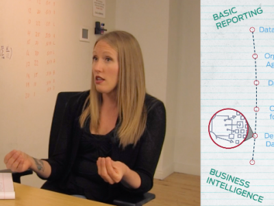
Every other Thursday someone from the Innovation Design team helps make analytics and data consumable for all. This week we tackle how to move from reporting to BI.
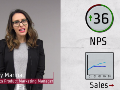
Discover how analytics can help your company avoid major missteps when your improving NPS doesn’t match your stagnate sales numbers.
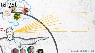
You don’t need a data scientists to effectively run an analytics program. Learn the five most important traits to look for when hiring a data analyst.

Find out what three traditional contact center metrics might be holding you back and explore a new way to look at contact center metrics.